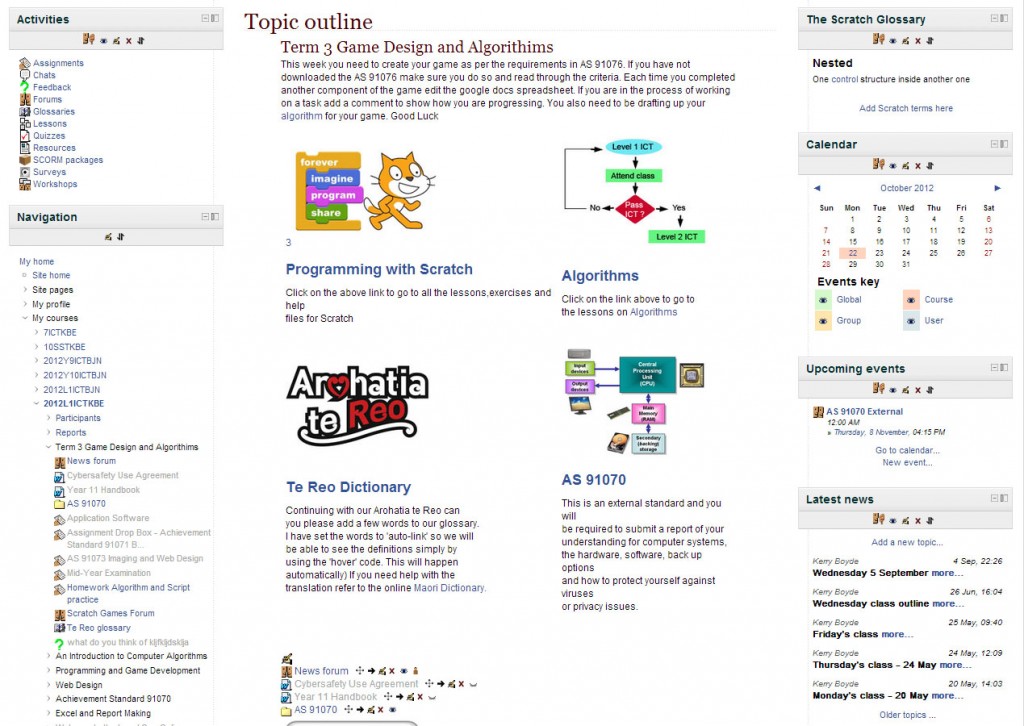
In this teaching pilot I changed the Moodle theme from ‘form factor’ to the ‘magazine’ layout. I wanted a clean simple look and a left and right column. I know how important the top section of the screen is on the landing page and wanted to provide students with links to different sections, at first glance. In my first teaching pilot, the site felt too heavily text based. Therefore, in an attempt to make it more visual, I created images that linked to different sections. Configuring the table to hold the images was often clunky and the server lagged, making this a slow process especially at school. Below is a screenshot from the modified homepage.
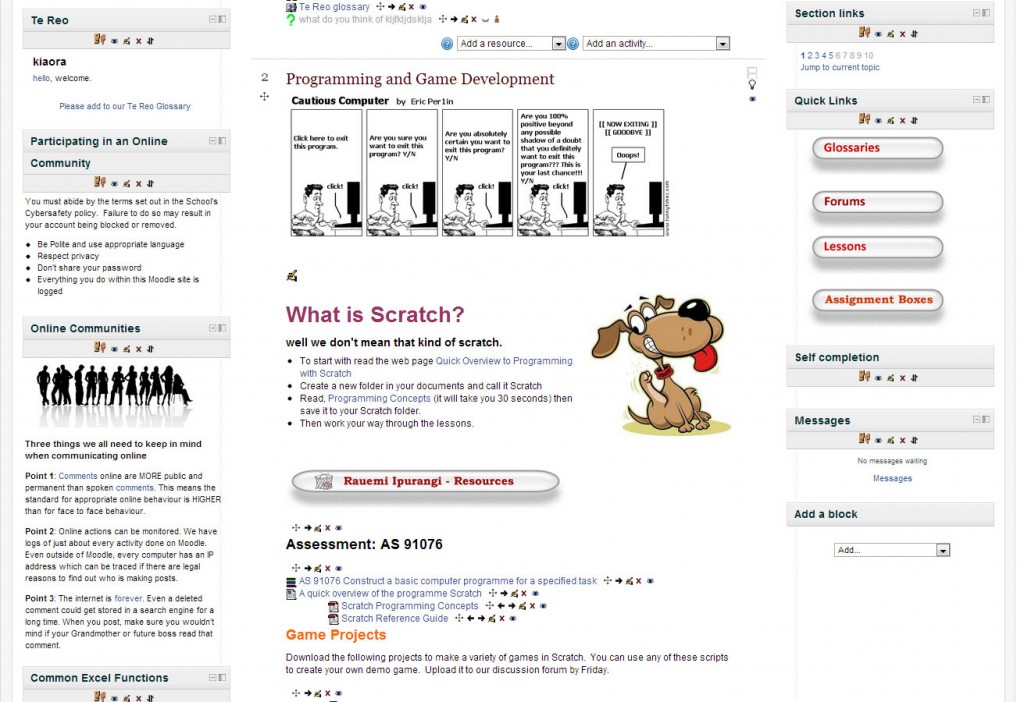
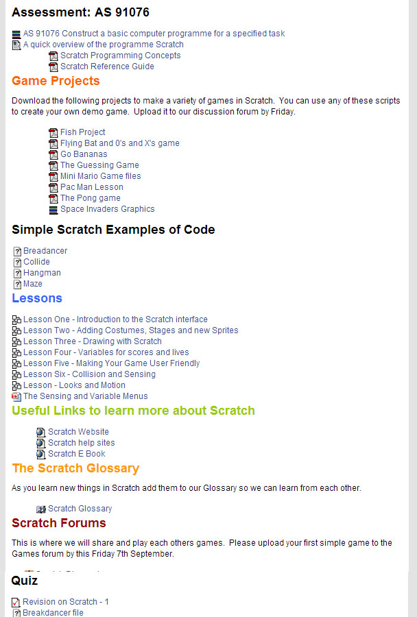
The section below shows the Scratch programming unit. I created my own buttons to give quick links to different sections and included them in an HTML block in the sidebar.


